
Firm operations
Choosing a Chart of Accounts That Scales: Numbering, Naming, and the Discipline Behind Books a Firm Can Grow On
The chart of accounts decides which questions your books can answer. The standard number map, the detail dial, seven design rules, an industry flavor guide, and the firm template — with the categorization research behind why it matters.

The short answer

Your chart of accounts decides which questions your books can answer. Every profit-and-loss line, every tax return schedule, every "why did margin fall?" investigation, every KPI a client asks about — all of it flows from the list of accounts you chose, probably in an afternoon, when the books were first set up. Most businesses never revisit it. The ones that scale revisit it deliberately.
The mechanics are not complicated. A standard numbering convention puts assets in the 1000s, liabilities in the 2000s, equity in the 3000s, revenue in the 4000s, cost of goods sold in the 5000s, and operating expenses in the 6000s. Early-stage guidance lands around 25 to 40 accounts total — three to five cost-of-sales accounts, six to eight operating expense categories — with gaps left in the numbering so new accounts slot in without renumbering history. Parent accounts only where reporting genuinely needs the roll-up. One page of posting rules so two people code the same transaction the same way.
But the interesting part is not the mechanics. It is that the chart is the highest-leverage document in the books, the coding interface every bookkeeper and every AI touches daily, and the thing firms almost never design on purpose. This article covers why the chart is a growth decision, the number map in full, how much detail is right, seven design rules, a worked example of one coding decision moving gross margin five points, industry flavors, the firm master template, and how the chart runs inside LedgerHQ.
Why the chart is a growth decision, not a setup chore
The chart of accounts is where bookkeeping accuracy actually lives. A June 2026 benchmark from accounting software maker Digits — "Beyond the AI Hype" — ran 2,000 real small-business transactions through 13 frontier AI models and a panel of 12 outsourced human accountants, all checked against a U.S. GAAP ground-truth set reviewed by professional accountants. The humans scored 79.1% accuracy at categorizing transactions. Digits' own AI system hit 97.8%, and for the first time, five general-purpose frontier models cleared the human bar too.
Sit with that number. Trained, paid professionals put one in five transactions in the wrong bucket. And the bucket list is the chart. A vague, sprawling, or cryptic chart does not just annoy the bookkeeper — it degrades every classification decision made against it, because when the options are numerous and similar, two people classify the same transaction differently. The chart is the coding interface. Its quality is the ceiling on coding accuracy, human or AI.
The consequences leak straight into taxes. A March 2026 national survey by 1-800Accountant found that 57% of small business owners admitted they had deducted a business expense they knew was questionable at the time — and the most confusing deductions were the everyday ones: vehicle expenses and mileage, home office. That confusion is downstream of the chart. When there is no clear account for a cost, the cost lands somewhere approximately right, and approximately right is where gray-area deductions are born. A well-designed chart does not eliminate tax judgment, but it removes the structural ambiguity that makes bad deductions easy.
And the errors compound. Focus CPA's rundown of the most common bookkeeping errors reads like a chart-of-accounts postmortem: misclassifying transactions — especially the capital-expenditure versus operating-expense line that changes both cash flow and taxes — mixing business and personal expenses through the same accounts, and books updated so sporadically that the numbers are stale before they are reviewed. Every one of those is easier in a bad chart and harder in a good one.
The chart also decides what the owner can ever know. As one practitioner put it: your chart of accounts decides which questions you can ask. An implausible margin is usually a mapping problem. If the chart has no account for freight-in, the freight lands wherever the bookkeeper guesses — and the gross margin line the owner reads every month is fiction. The chart is not the business's accounting plumbing. It is the business's nervous system.
The number map
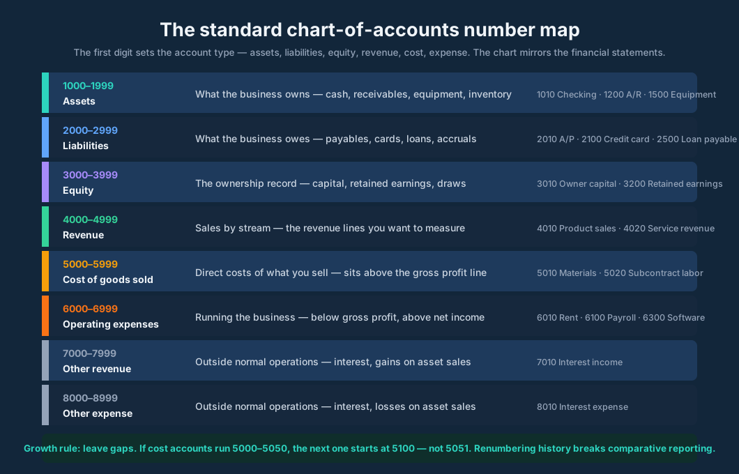
The standard convention is simple and worth adopting exactly as written, because it is what every software package, every accountant, and every future finance hire expects. The first digit of the account number sets the account type:
| Range | Type | What lives here |
|---|---|---|
| 1000–1999 | Assets | What the business owns: cash, receivables, equipment, inventory |
| 2000–2999 | Liabilities | What the business owes: payables, cards, loans, accruals |
| 3000–3999 | Equity | The ownership record: capital, retained earnings, draws |
| 4000–4999 | Revenue | Sales, broken by the streams you want to measure |
| 5000–5999 | Cost of goods sold | Direct costs of what you sell — above the gross profit line |
| 6000–6999 | Operating expenses | Running the business — below gross profit, above net income |
| 7000–7999 | Other revenue | Outside normal operations: interest, gains on asset sales |
| 8000–8999 | Other expense | Outside normal operations: interest, losses on asset sales |
Two refinements make the map durable. First, the sub-ranges: current assets open the 1100s, fixed assets the 1200s, other assets the 1300s. The sequence mirrors the balance sheet — assets listed from most to least liquid, cost of sales above the gross profit line, operating expenses below it. When the chart mirrors the statement layout, reports come out clean without reformatting. If you ever have to explain to a lender or a buyer where a number came from, the trace from chart to statement to source document is straight.
Second, the gaps. This is the rule firms break most often, and it costs the most to fix. If your cost accounts run 5000 to 5050, the next one starts at 5100 — not 5051. Gaps let you insert accounts later without renumbering history, and renumbering history is how comparative reporting breaks. A four- or six-digit scheme with the first digit as the type — 1 for assets, 2 for liabilities, and so on — leaves room for decades of growth. The numbers themselves are cosmetic. The convention is the point.
Naming matters as much as numbering. Every account description should be easy to understand, and abbreviations must not become cryptic. "Meals — client" survives a staff change; "M-CL" does not. Add a one-line description to each account explaining what belongs in it — the description is what the person coding a transaction at 11 PM on a Friday actually reads. The one-page posting rules document (more on that below) and the account descriptions are the two pieces of writing that make a chart hold up over time.
The detail dial
The most common design failure is not wrong numbers. It is wrong granularity — and it fails in both directions.
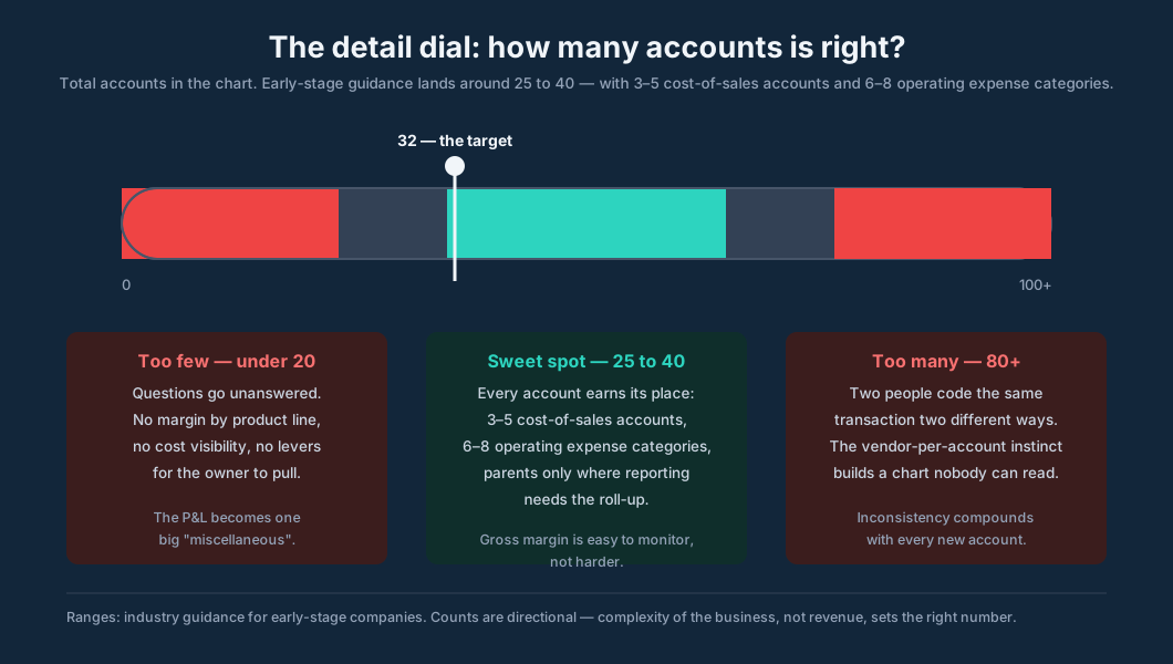
Too few accounts, and questions go unanswered. A twelve-account chart cannot tell the owner the margin by product line, cannot separate recurring revenue from one-time projects, cannot show which cost is climbing. The P&L becomes one big "miscellaneous," and the owner stops reading it — which is the quiet death of the monthly financial review.
Too many accounts, and coding becomes inconsistent. The instinct to create an account for every vendor — "Amazon," "Home Depot #4412," "Misc office" — produces a chart nobody can read, and two people will classify the same transaction differently when the options are numerous and similar. Duplicated categories are the classic symptom: Advertising at 6010, Marketing at 6015, Promotions at 6020, three homes for the same dollar. Dead accounts linger in selection lists for years, collecting stray postings long after the business moved on.
The sweet spot for an early-stage company is 25 to 40 accounts: three to five cost-of-sales accounts and six to eight operating expense categories. Fewer accounts under cost of sales makes gross margin easier to monitor, not harder — the margin signal gets cleaner as the noise accounts disappear.
Parents and subaccounts are a tool, not a reflex. Use the hierarchy where it adds genuine reporting clarity: a Payroll parent for wages, payroll taxes, and benefits; a Technology parent for tracked subscriptions; a parent with specific vendors or jobs beneath it when the roll-up is what the owner reads. Each additional level creates a classification decision that must be made consistently, forever. If nobody reads the parent total, the parent is overhead.
And the vendor question, settled: vendors are not accounts. Vendors are dimensions — names, classes, or tags attached to transactions coded to real accounts. "Amazon" is where you bought it; "Office supplies" is what it was. The moment a vendor becomes an account, the chart starts growing with every receipt.
Retired accounts get made inactive, not deleted. Confirm the balance, check the mappings and recurring transactions, then inactivate: the history stays intact for prior-period reports while the account leaves everyday selection lists. Deleting is archaeology in reverse — it destroys the record you will need when the prior year gets questioned.
Seven design rules that hold up
These are the rules that separate charts that scale from charts that get rebuilt every two years.
1. Start from the revenue question. Before touching expenses, ask the owner: what are the high-level revenue streams you want to measure? A reseller might track products, recurring services, and professional services — or, more granularly, products, SaaS and subscriptions, managed services, and security. The revenue section is the only part of the chart the owner reads with real attention. Design it for the questions they will ask in eighteen months, not the invoices they have today.
2. Keep deferred revenue far from recognized revenue. Combining them misrepresents the picture and creates real problems in any audit or diligence process. Customer deposits and prepaid contracts are liabilities until earned — 2000s, not 4000s. This is the one structural rule with legal teeth.
3. Sequence the chart like the statements. Assets most to least liquid. Cost of sales above the gross profit line. Operating expenses below it. The chart mirrors the balance sheet and the P&L, so the reports assemble themselves.
4. Write the one-page posting rules. A single page covering the common ambiguities: contractor invoices versus employee payroll, marketing versus advertising, repairs versus capital improvements, freight-in versus delivery expense, owner draws versus distributions. This document — not the numbering — is what keeps two bookkeepers coding identically. Review it at year end and adjust.
5. Give every account a plain-English description. The description field is the cheapest control in accounting. "Postage, couriers, and shipping supplies — not freight-in on inventory" resolves in one line what a naming convention never fully can.
6. Design subaccounts for responsibility, not curiosity. Subaccounts by location or department let each manager be held accountable for meeting budgets — responsibility accounting, real and useful. Subaccounts by vendor, by whim, or "just in case" are how charts reach eighty accounts. Every subaccount should answer to a report someone actually runs.
7. Review the chart every year end. Businesses change shape: new revenue streams, new locations, dead product lines. The annual review adds what the year proved necessary, inactivates what died, and keeps the numbering gaps intact. A chart that never gets reviewed is a chart that gets rebuilt — expensively, under deadline, usually during a cleanup engagement.
One coding decision, five margin points
Here is what the chart is worth, in arithmetic. Take a service-and-product business with $240,000 of monthly revenue, coded two ways:
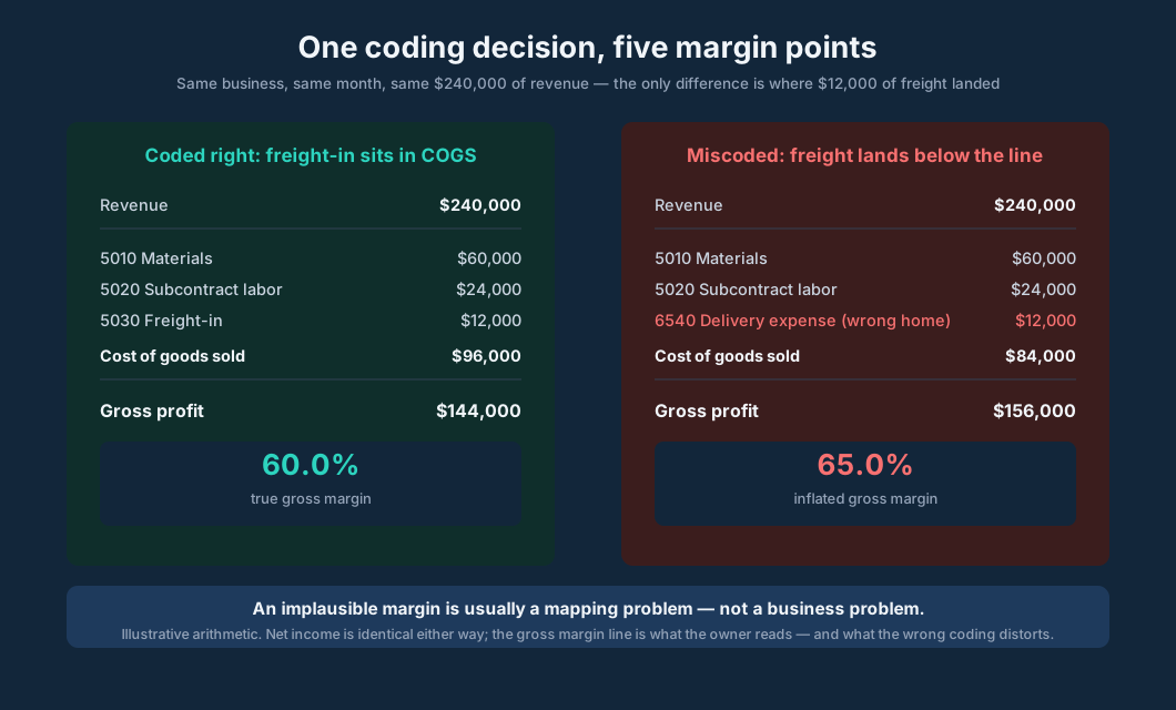
Coded right, freight-in sits in COGS at 5030. Materials $60,000, subcontract labor $24,000, freight-in $12,000: cost of goods sold is $96,000, gross profit $144,000, margin 60.0%.
Miscoded, the $12,000 of freight lands in "Delivery expense" at 6540 — an operating expense below the gross profit line. Cost of goods sold drops to $84,000, gross profit rises to $156,000, margin 65.0%. Net income is identical either way. The gross margin line — the number the owner reads, the number the bank covenants on, the number the buyer diligence-checks — is five points of fiction.
This is not a contrived edge case. It is the single most common chart failure in small business books: direct costs stranded below the gross profit line because the chart had no clear home for them, or because the bookkeeper guessed. The fix is structural, not supervisory: a 5000s section with named accounts for each direct cost, a posting rule that says "freight-in on inventory goes to 5030, always," and a monthly review that glances at the margin and asks whether it moved for a business reason or a mapping reason.
The same logic runs in reverse for the sprawl chart. Compare what the reviewer faces:
| The 47-account sprawl (illustrative) | The 32-account scale chart (illustrative) | |
|---|---|---|
| Cost of sales | 11 accounts incl. "Amazon," "Misc COGS," "Job costs?" | 4 accounts: materials, sub labor, freight-in, other direct |
| Operating expenses | 24 accounts, three for advertising variants | 7 categories with one-page posting rules |
| Revenue | One "Sales" account | 3 streams the owner chose deliberately |
| Dead accounts | 9 still selectable, collecting strays | Inactive, history preserved, off the lists |
| Review time | Archaeology: what did this account mean? | The margin tells the story |
The sprawl chart costs the firm twice: once in coding inconsistency, once in review time. The reviewer cannot review what they cannot interpret.
Industry flavors
The template bends by industry — the blocks stay the same, the accounts inside them change.
Contractors and trades live in the 5000s. Job materials, subcontract labor, equipment rental, permits, and freight belong above the gross profit line, because the job margin is the business's vital sign. Revenue splits by contract revenue, change-order revenue, and retainage. Deferred revenue discipline matters here more than anywhere: deposits on unstarted jobs are liabilities, and combining them with recognized revenue is how contractors look profitable while going broke.
E-commerce and product businesses need inventory accounts in the 1000s (raw materials, work in progress, finished goods, by SKU group if the catalog is large), freight-in and merchant fees in the 5000s, and shipping income as its own 4000s line if shipping is charged separately. The chart has to support the inventory equation — beginning inventory plus purchases minus ending inventory — or cost of goods sold is a guess.
Professional services barely need the 5000s at all; the cost story lives in the 6000s — payroll, contractors, software, professional development. Revenue splits by engagement type: recurring retainers versus project work is the split that tells the owner which half of the business is compounding. Client-reimbursable expenses get their own account so pass-throughs never inflate the cost base.
Multi-location or multi-department businesses add the second dimension: subaccounts or classes by location and department, so each manager owns a budget and the firm can compare units. The chart stays one chart — the dimension does the segmenting, not a second chart per location.
In every case, the revenue question comes first. The accounts a business needs are a function of its complexity — its revenue streams, its cost structure, its locations — not its revenue size. A $500,000 contractor with three crews needs a more detailed chart than a $2,000,000 solo consultant.
The firm template
For a bookkeeping firm, the chart is infrastructure — and infrastructure gets built once, deliberately, then deployed. The pattern that works: one master template chart, and every client inherits it.
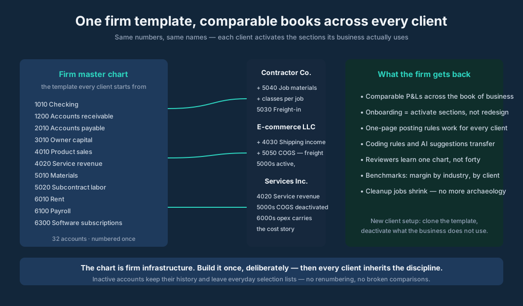
The mechanics: the firm designs its template — standard numbering, firm-standard names, one-page posting rules — and each new client starts from it. The client activates the sections its business uses and deactivates the rest. The contractor gets the 5000s with job-cost accounts; the services firm deactivates COGS and leans on the 6000s; the e-commerce client gets inventory and freight accounts. Same numbers, same names, everywhere.
What the firm gets back is the whole point of the discipline:
- Comparable P&Ls across the book of business — margin benchmarks by industry, by client, from one consistent structure.
- Faster onboarding — setup is activating sections, not redesigning a chart per client.
- One set of posting rules that works for every client, because the accounts are the same accounts.
- Coding rules and AI suggestions that transfer — the pattern learned on one contractor's freight-in applies to the next.
- Reviewers who learn one chart, not forty — review time falls, review quality rises.
- Cleanup jobs that shrink — the new client arrives with a sane chart instead of vendor-named archaeology.
The template is a firm discipline, not a software button — the same honesty posture as the monthly review itself. What the software has to do is narrower: give every company its own chart, keep history intact when accounts retire, and make the chart the spine that coding, reports, and drill-downs all hang from. Which is exactly where the product section below picks up.
Running the chart in LedgerHQ
The chart is where LedgerHQ's bookkeeping starts, and every claim below was verified against the live LedgerHQ product documentation on October 10, 2026.
Company setup includes the chart from the beginning: create a company, add its owner, choose a starting path, complete its profile, and verify the chart of accounts. The chart is not an afterthought buried three menus deep — it is part of standing the company up.
Bringing a client over carries the chart with it. Export two files from QuickBooks Online — the Journal report and the chart of accounts — and import the company's whole history through Tally: read the preview before anything posts, then prove the result in the chart, the register, and the trial balance. The existing chart survives the move; the firm then applies its template discipline to it.
Building books from bank CSVs works the same way from the other direction: attach the statements, let Tally identify the accounts and code the history, answer the handful of vendors she is unsure of, read the financial preview before anything posts, and prove the imported books in the chart of accounts, the register, and the balance sheet. The chart is the frame Tally builds into — which is why the firm's template discipline matters even in an AI-coded workflow: Tally codes into accounts, and the accounts have to be the right ones.
Day to day, the chart is the coding surface. Bank feed rows get coded to accounts and posted; uncoded or unposted rows do not affect reports yet, so the ledger always shows what exists and the review shows what still needs work. The reports — Income Statement, Balance Sheet, Trial Balance, General Ledger, on Cash or Accrual — drill straight into the chart: click any account name or amount to expand its activity inline, dates and descriptions and debits and credits, and open the source journal entry from there. When the margin looks implausible, the mapping investigation is seconds.
LedgerHQ runs $20 per month per business, with a Free Preview through January 1, 2027 (verified September 30, 2026).
FAQ
How many accounts should a small business chart have? Early-stage guidance lands around 25 to 40 accounts total: three to five cost-of-sales accounts and six to eight operating expense categories. Complexity of the business sets the number, not revenue size — a contractor with three crews needs more detail than a solo consultant at four times the revenue.
Should account numbers have gaps? Yes — always leave gaps. If cost accounts run 5000 to 5050, the next one starts at 5100, not 5051. Gaps let you insert accounts later without renumbering history, and renumbering history is how comparative reporting breaks.
What is the standard chart of accounts numbering? Assets 1000–1999, liabilities 2000–2999, equity 3000–3999, revenue 4000–4999, cost of goods sold 5000–5999, operating expenses 6000–6999, other revenue 7000–7999, other expense 8000–8999. The first digit sets the type; sub-ranges (1100s current assets, 1200s fixed assets) add structure.
Should each vendor get its own account? No. Vendors are a dimension — a name or tag on the transaction — not accounts. "Amazon" is where you bought it; "Office supplies" is what it was. Vendor-per-account is the fastest route to an eighty-account chart nobody can code against consistently.
How do you fix a chart that has grown out of control? At year end: consolidate duplicated categories, inactivate (never delete) dead accounts so history stays intact, add the accounts the year proved necessary, and write the one-page posting rules. Most cleanup engagements are chart archaeology — a maintained chart never needs one.
Can AI code accurately against a bad chart? The chart is the ceiling. A June 2026 benchmark found human accountants at 79.1% categorization accuracy on 2,000 real transactions — and when the account options are numerous, similar, or cryptic, accuracy falls for humans and AI alike. A disciplined chart with clear names, descriptions, and posting rules is what makes both accurate.
Sources
- Chart of accounts governance — account numbering (1000s assets through 8000s other expense), parent/subaccount discipline, inactive accounts, posting rules — cocountant.com, August 2026 — https://cocountant.com/blog/accounting/what-is-a-chart-of-accounts-and-why-does-yours-need-a-redesign/
- Chart of accounts numbering and naming conventions; leave space between numbers; simple names; per-account descriptions; year-end review — Whalen CPA, November 2024 — https://www.whalencpa.com/2024/11/chart-a-course-for-success-with-a-detailed-chart-of-accounts/
- Same conventions reference — GBQ Partners — https://gbq.com/chart-a-course-for-success-with-a-detailed-chart-of-accounts/
- "Your chart of accounts decides which questions you can ask" — leave gaps (5000–5050, next at 5100); 25–40 accounts; 3–5 cost-of-sales; 6–8 opex; parents vs flat sprawl; deferred vs recognized revenue; "an implausible margin is usually a mapping problem" — Joe Tedrick, LinkedIn, August 2026 — https://www.linkedin.com/pulse/your-chart-accounts-decides-which-questions-you-can-ask-joe-tedrick-codic
- Chart of Accounts 101 — four/six-digit schemes (Jennifer Johnson, UT Dallas); responsibility accounting via subaccounts; revenue-stream design question (Buchianico) — ChannelPro Network, May 2022 — https://www.channelpronetwork.com/2022/05/25/chart-of-accounts-101/
- Digits "Beyond the AI Hype" benchmark — June 2026: 2,000 transactions, U.S. GAAP ground truth; humans 79.1%, Digits AI 97.8%, five frontier models above the human bar — via Startup Fortune, October 2026 — https://startupfortune.com/ai-models-beat-human-accountants-on-bookkeeping-accuracy-in-new-benchmark/
- 1-800Accountant survey — 57% of 300+ small business owners admitted questionable deductions; vehicle/mileage and home office most confusing — Business Wire, March 12, 2026 — https://www.businesswire.com/news/home/20260312561141/en/1-800Accountant-Survey-Finds-57-of-Small-Business-Owners-Admit-Taking-Questionable-Tax-Deductions
- Most common bookkeeping errors — misclassification (capex vs opex), mixing business/personal, unreconciled accounts, stale reporting — Focus CPA via EIN Presswire, September 2026 — https://www.einpresswire.com/article/942354742/focus-cpa-identifies-the-most-common-bookkeeping-errors-hurting-small-business-cash-flow
- LedgerHQ Docs — Videos: company setup verifies the chart of accounts; QuickBooks import carries the chart; Tally identifies accounts building books from CSVs — https://ledgerhq.pro/docs/help/videos
- LedgerHQ Docs — Reports: Cash/Accrual IS/BS/TB/GL with inline drill-down to journal entries; uncoded/unposted feed rows excluded — https://ledgerhq.pro/docs/help/reports